Data Visualization: Most Common Mistakes – Part I
1 min read
Proper data visualization is not just about clean and reliable data. Equally important are structure, clarity, and readability. In this post, we’ll take a look at examples of charts and graphics where the authors failed to accurately reflect reality — either by mistake or in an attempt to mislead the audience on purpose.
We’ve grouped the most common mistakes — or manipulations, if you will — into a few categories. Let’s go through them one by one.
1. Scale
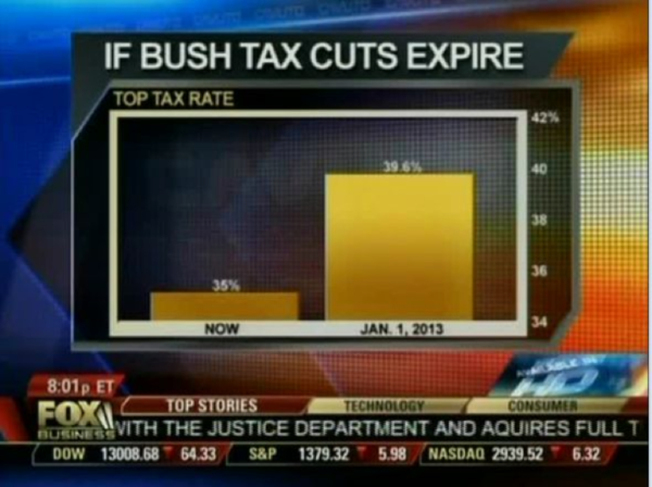
Using a scale that doesn’t start at zero (intentionally or not) creates an artificial exaggeration of differences that are actually much smaller.
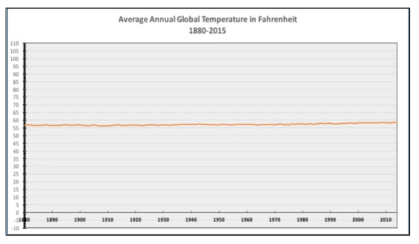
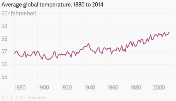
2. Y Axis
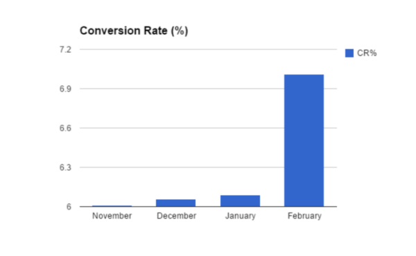
An overly stretched or compressed Y axis can work wonders — for better or worse.
Here’s an example showing that sometimes it’s worth “cutting off” the Y axis above zero. This is especially useful when analyzing a single variable. The first temperature chart doesn’t say much, but the second one reveals the trend clearly.
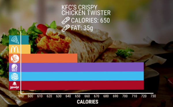
3. X Axis
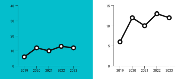
Mistakes or manipulations on the time axis can lead to very misleading interpretations.
The first chart below may look fine at first glance, but it’s far from OK. The next one shows the actual source data, clearly indicating that the unemployment trend has stabilized over the past year.
4. Color in Maps
Poor color choices make heatmaps hard to read or interpret intuitively. Below are two examples that confuse rather than clarify. The first lacks consistent gradient steps, and the second uses colors poorly (not to mention the unfortunate use of absolute values).

We’ll explore more examples of bad data visualization practices — including perspective and unit distortion — in the next post on our blog. Stay tuned for the second part of this series.
Sources and helpful links:
We are increasing company value, for real